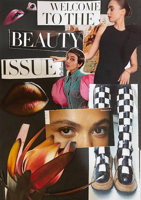
Digital Photography & Imaging - Project 1
25.9.2023-7.11.2023 / Week 1- Week 6
Aliah Farhana Binti Mohd Fauzi /
0357957
Typography / Bachelor of Design (Honours) in Creative Media
Task
1: Collage & Digital Imaging
LECTURES
Week 1
Introduction To Digital Photography & Imaging
The importance of Photoshop for the Graphic Designer :
- Express your creativity
- Create graphic design
- Restoration of old images
- Integrate graphics with text artistically
- Make use of brushes
- Change photo colour
- Rectify mistakes in photographs
- Follow the tutorials
- Experiment
- Memorise All Keyboard Shortcuts
- Try to Replicate Others Work
- Do Participate in Design Competitions
- Subscribe to Online Galleries
- Smart Objects for smart Designers
- Scaling Artworks and Proportions
- Use Actions to Personalise Work
- Organise the Files Properly
Week 2
Introduction to Composition
Introduction to basic composition :
- Focal Point
- Scale & Hierarchy
- Balance The Elements
- White Space
- Use composition techniques that are in line with what's naturally pleasing to the eyes.
- Creatively use negative space.
- Create conversation between the subject and background.
- Allow you to draw and pinpoint specific areas of a document.
- Great to use with a graphic tablet because it is similar to a pencil.
- The way that you add points and the way you drag the tool as you create the points determines how they will look.
- The fewer points, the smoother a path will be.
- Brightness / Contrast - makes adjustments to the tonal range of your image.
- Levels - modify the tonal values in an image by adjusting the levels of the shadows, mid tones, and highlights.
- Curves - adjust as many points as you want throughout the entire tonal range of your image, and is the most powerful and precise tool for editing the tones in an image.
- Exposure - lets you adjust exposure levels with three sliders: Exposure (highlights of the image), Offset (adjust the mid tones) and Gamma (adjust the dark tones).
- Selective Colour - adjustment layer selectively modifies the amount of a primary colour without modifying the other primary colours in your image.
- Emphasis
- Balance and alignment
- Contrast
- Repetition
- Proportion
- White Space
- Movement
INSTRUCTIONS

|
| Figure 2.0 Composition #1, Week 2 (03/10/23) |

|
| Figure 2.1 Composition #2, Week 2 (03/10/23) |

|
| Figure 2.2 Composition #3, Week 2 (03/10/23) |

|
| Figure 2.3 Composition #1, Week 3 (10/10/23) |

|
| Figure 2.4 Composition #1 + Golden Ratio |

|
| Figure 2.5 Composition #2, Week 3 (10/10/23) |

|
| Figure 2.6 Composition #2 + Rules of third |

|
| Figure 2.7 Composition #3, Week 3 (10/10/23) |

|
| Figure 2.8 Composition #3 + Golden Ratio |

|
| Figure 2.9 Final Physical Collage, Composition #3 |

|
| Figure 2.10 Final Digital Collage, Composition #3 |
I would like to call this work of mine “The world full of lies”. Each of the pictures that I've used for this collage have meaning behind it, for example, the typewriter and the black texture liquid depict the news that have been going around the cities (the blue building). To add more, the background as the sky that has been polluted and the plants that seem to grow less each day because of human activities. Lastly, the fish scale on the left top is to show the boring world could be changed with mere entertainment in this world. As for the humans in that collage, he depicts the human population where we just watch the world change as time flies.

|
| Figure 2.11 Final Digital Collage, Composition #3 (After editing) |
For this collage of mine I decided to use the golden ratio to ensure the hierarchy. Therefore, I edited this collage by brightening up the layers a bit and I toned down the color to make it look pleasing to the eyes. I chose this collage because it seems to have harmony in my point of view and the color makes this collage look coherent since it has kinda the same color palette. Furthermore, the editing tools that I have used for this collage is ‘Level (Darker), Vibrance (-33), Saturation (-13), Brightness (-19) and Contrast (17)’.
Project 1B, Part 1 : Digital Imaging Exercise

|
| Figure 2.12 Practice - Heart Mansion n Shazam, Week 6 (31/10/2023) |

|
|
Figure 2.13 Heart Mansion n Me, Week 6 (31/10/2023) |


Comments
Post a Comment