Typography Task 1 / Exercises 1 & 2
25.9.2023-5.11.2024 / Week 1- Week 6
Aliah Farhana Binti Mohd Fauzi / 0357957
Typography / Bachelor of Design (Honours) in Creative Media
Task 1 : Exercise 1 & 2
Aliah Farhana Binti Mohd Fauzi / 0357957
Typography / Bachelor of Design (Honours) in Creative Media
Task 1 : Exercise 1 & 2
LECTURES
Week 1 / Introduction & Briefing
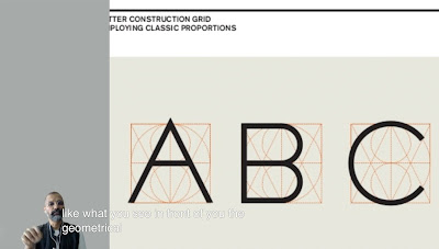 |
| Figure 1.1 Letter Construction Grid |
 |
| Figure 1.1.1 Typography as GIF |
 |
| Figure 1.1.2 Typography in website design |
Typography is also visible and prevalent in website design.
Font : Refers to individual font or weight within a typeface.
There's also some wise words from Sir Vinod in this video that has convinced me like:
"You cannot run before you learn to walk".
"You need to understand the rules before you learn to break them".
"Don't get overly frustrated be determined be persistent and learn cause learning is not easy", said Sir Vinod when you get feedbacks from the lecturers.
 |
| Figure 1.1.3 Difference between font and typeface |
Typeface : Refers to the entire family or fonts or weights that share similar characteristics or styles.
Writing sequence:
Is a compressed version of square capitals, this allowed for twice as many words on a sheet of parchment and took far less time to write. Although, this writing were faster and easier, they were slightly harder to read due to their compressed nature.
 |
| Figure 1.1.4 Font |
 |
| Figure 1.1.5 Typeface |
 |
| Figure 1.1.6 Typo_0_Eportfolio Briefing |
As instructed by Sir Vinod I've watched the lecture video before the class started. Thus, this has gave me a clear idea what is going on before the class even started. In the video, we were instructed to do a blog for our e-portfolio for our final submission on week 14. We were told to do the e-portfolio using a Blogger only. Therefore, this e-portfolio is going to be the only platform that we're going to use throughout our degree for this program.
Week 2
Typography: Development / Timeline
 |
| Figure 1.2.1 Evolution from Phoenician letter |
Phoenicians: Wrote from right to left
The Greek: Writing style called 'boustrophedon' (how the ox ploughs), which meant the lines of text read alternately from right to left and left to right. The same goes to the orientation of the letterforms.
Like the Phoenicians, the Greeks did not use letter space or punctuations.
 |
| Figure 1.2.2 The Greek style of writing 'boustrophedon' |
 |
| Figure 1.2.3 Greek fragment, stone engraving. (Date unknown) Figure 1.2.4 Early letterform, development: Phoenician to Roman |
Hand script from 3rd - 10th century C.E.
 |
| Figure 1.2.5 4th or 5th century: Square Capitals |
A writing that can be found in Roman monuments. These letterforms have serifs added to the finish of the main strokes.
 |
| Figure 1.2.6 Late 3rd - mid 4th century: Rustic capitals |
 |
| Figure 1.2.7 4th century: Roman cursive |
 |
| Figure 1.2.8 4th - 5th century: Uncials |
 |
| Figure 1.2.9 C. 500: Half-uncials |
 |
| Figure 1.2.10 Example of ascenders and descenders |
 |
| Figure 1.2.11 C.925: Caroline minuscule |
Charlemagne, the first unifier of Europe since the Romans, issued an edict in 789 to standardise all ecclesiastical texts. He entrusted this task to Alcuin of York, Abbot of St Martin of Tours. The monks rewrote the text using both majuscules (uppercase), minuscule, capitalisation and punctuation which set the standard for calligraphy for a century.
Blackletter to Gutenberg's type
 |
| Figure 1.2.12 c. 1300:Blackletter (Textura) |
Text type classification (Dates of origin approximated to the nearest quarter century).
1450 Blackletter -> 1475 Oldstyle -> 1500 Script -> 1750 Transitional -> 1775 Modern ->
1825 Square Serif / Slab Serif -> 1900 Sans serif -> 1990 Serif / Sans Serif
Week 3
 |
| Figure 1.3 Typo_3_Text_P1 |
Typography: Text / Tracking: Kerning and Leading
 |
| Figure 1.3.1 Kerning Effects |
Letterspacing: Adding space between the letters.
Tracking: Addition and removal of space in a word or sentence.
 |
| Figure 1.3.2 Normal tracking, loose tracking and tight tracking. |
 |
| Figure 1.3.3 Flush left, Ragged right |
 |
| Figure 1.3.4 Centered, Ragged right and left |
 |
| Figure 1.3.5 Flush right, Ragged left |
 |
| Figure 1.3.6 Justified |
Text / Texture
 |
Figure 1.3.7 Anatomy of a typeface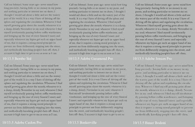 Figure 1.3.8 Different typefaces, different grey values Figure 1.3.9 Point Size and leading |
The 10 in (Figure 1.3.9) is the size of the point size while the 13.5 is the leading.
Leading: The space between adjacent lines of type.
Text / Leading and Line Length
Type size: Text type should be large enough to be read easily at arms length.
Line Length: Good rule of thumb is to keep line length between 55-65 characters. Extremely long or short lines length impairs reading.
 |
| Figure 1.3.10 Example of Bad Leading Figure 1.3.11 Same typeface, different leading |
A type Specimen book (or ebook for screen) is to provide an accurate reference for type, type size, type leading, type line length etc.
 |
| Figure 1.3.12 Sample Type Specimen Sheet |
 |
| Figure 1.4 Typo_4_Part 2 |
 |
| Figure 1.4.1 Pilcrow in Paragraph |
 |
| Figure 1.4.2 Line space in text or paragraph |
 |
Figure 1.4.3 Line space vs Leading Figure 1.4.4 Standard Indentation |
Typically here the indent is the same size of the line spacing or the same as the point size of your text. Indentation also was used to save space in newspaper this is because the expenses of printing newspaper is expensive.
Important Notes!
When using indentation don't you ever use left alignment and never have ragging on the right. This is because indentation is best use when the text is justified.
This method creates unusually wide columns of text. Despite these problems, there can be strong compositional or functional reasons for choosing it.
 |
| Figure 1.4.5 Method of extended paragraph |
Text / Widow and Orphan
Widow: A short line of text left alone at the end of a column of text.
Orphan: A short line of text left alone at the start of new column.
 |
| Figure 1.4.6 Sample of widow and orphan |
 |
| Figure 1.4.8 Using different typeface and bold it or highlight it with colour |
 |
| Figure 1.4.9 Alert to match the x-height |
 |
| Figure 1.4.10 Highlighting by placing a box |
 |
| Figure 1.4.11 Placing typographic elements |
 |
| Figure 1.4.13 A headline |
 |
| Figure 1.4.14 B headline |
 |
| Figure 1.4.15 C headline |
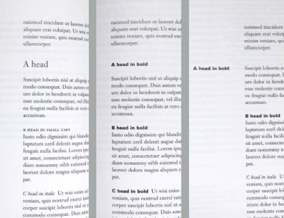 |
| Figure 1.4.16 Example when putting together a sequence of subheads = hierarchy |
 |
| Figure 1.4.17 Bad Cross aligning headlines |
In this example (Figure 1.4.17), four lines of caption type (leaded 9 pts.) cross-align with three lines of text type (leaded to 13.5 pts.).
 |
| Figure 1.4.18 Good Cross Aligning headlines |
 |
| Figure 1.4.19 Tips from the lecture video by Sir Vinod |
Week 5
 |
| Figure 1.5 Typo_2_Basic |
 |
| Figure 1.5.1 Baseline, Median and X-height |
Median: The imaginary lie defining the x-height of letterforms.
X-height: The height in any typeface of the lowercase 'x'.
 |
| Figure 1.5.2 Stroke |
Stroke: Any line that defines the basic letterform.
 |
| Figure 1.5.3 Apex/Vertex |
 |
| Figure 1.5.4 Arm |
 |
| Figure 1.5.5 Ascender |
Ascender: The portion of the stem of a lowercase letterform that projects above the median.
.jpeg) |
| Figure 1.5.6 Barb |
.jpeg) |
| Figure 1.5.8 Bowl |
.jpeg) |
| Figure 1.5.10 Cross Bar |
.jpeg) |
| Figure 1.5.11 Cross Stroke |
.jpeg) |
| Figure 1.5.13 Descender |
An en: Is half the size of an em.
.jpeg) |
| Figure 1.5.16 Finial |
.jpeg) |
| Figure 1.5.17 Leg |
 |
| Figure 1.5.20 Loop |
.jpeg) |
| Figure 1.5.21 Serif |
.jpeg) |
| Figure 1.5.22 Shoulder |
.jpeg) |
| Figure 1.5.24 Spur |
.jpeg) |
| Figure 1.5.26 Stress |
.jpeg) |
| Figure 1.5.29 Terminal |
Basic / The font
- Uppercase and Lowercase
- Small Capitals
- Uppercase Numerals and Lowercase Numerals
- Italic
- Italic vs Roman
- Punctuation, miscellaneous characters
- Ornaments
Basic / Describing typefaces
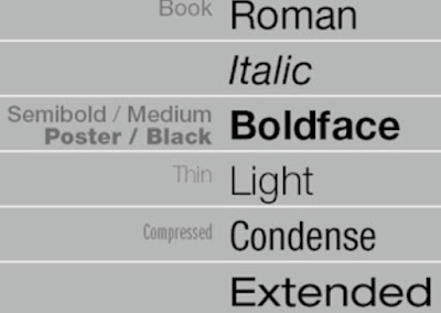 |
| Figure 1.5.30 Describing Typefaces |
Italic named for fifteenth century Italian handwriting on which the forms are based. Oblique conversely are based on roman form of typeface.
Boldface characterised by a thicker stroke than a roman form. It can also be called semibold, medium, black, extra bold, or super.
Light a lighter stroke than the roman form. Even lighter strokes are called 'thin'.
Condense a version of the roman form, and extremely condense styles are often called 'compressed'.
Extended an extended variation of a roman font.
Basic / Comparing typefaces
 |
| Figure 1.5.31 Comparing typefaces |
Week 6
 |
| Figure 1. 6 Type_5_Understanding |
 |
| Figure 1.6.1 Baskerville 'A' |
 |
| Figure 1.6.2 Univers 'A' |
 |
| Figure 1.6.3 Helvetica vs Univers |
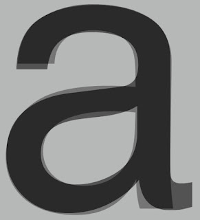 |
| Figure 1.6.4 When Helvetica and Univers on top of each other |
Letters / Maintaining x-height
 |
| Figure 1.6.5 Median and baseline |
Letters / Form / Counterform
 |
| Figure 1.6.6 Form / Counterform |
Letters / Contrast
 |
| Figure 1.6.7 Contrast |
INSTRUCTIONS
<iframe src="https://drive.google.com/file/d/1XVAyrxLmsnQ95puZbk3KsrDqY4D11V2f/preview" width="640" height="480" allow="autoplay"></iframe>
Task 1 : Exercise 1 - Type Expression
For Exercise 1, we are given a set of words to create type expressions of. Those words are smoke, soup, spooky, power, impact, crunch, drunk and fold. No graphical elements are allowed and we are limited to only use 10 typefaces that are given, which are:
- Adobe Caslon Pro
- Bembo Std
- Bodoni Std
- Futura Std
- Gill Sans Std
- ITC Garamond Std
- ITC New Baskerville Std
- Janson Text LT Std
- Serifa Std
- Univers LT Std
1. Moodboard
 |
| Figure 2.1 Inspiration board for 'Soup' |
 |
| Figure 2.2 Inspiration board for 'Spooky' |
 |
| Figure 2.3 Inspiration board for 'Drunk |
 |
| Figure 2.4 sketches (13/10/23) |
 |
| Figure 2.5 First attempt on digitisation (14/10/23) |
 |
| Figure 2.6 'Soup' Before and after feedbacks from Sir Vinod (15/10/23) |
 |
| Figure 2.7 'Smoke' Before and after feedbacks from Sir Vinod (15/10/23) |
 |
| Figure 2.8 Final Type Expressions - JPEG,Week 3 (15/10/23) |
Figure 2.9 Final Type Expressions - PDF, Week 3 (15/10/23)
4. Type Expression Animation
.gif) |
| Figure 2.9 Type animation practice, Week 3 (13/10/23) |
 |
| Figure 2.10 Final Type Animation, Week 3 (15/10/23) |
 | |
|
Task 1 : Exercise 2 - Text Formatting
For this Exercise 2, We are tasked with doing one final A4 layout addressing different areas of text formatting such as type choice, type size, leading, line-length, paragraph spacing, forced-line-break, alignment, kerning, widows and orphans and cross-alignment. This exercises, will help us to increase our familiarity and capability with the appropriate software and develop our knowledge of information hierarchy and spatial arrangment.
Lecture 1/4 of Text Formatting : Kerning and Tracking
 |
| Figure 2.12 Text Formatting without Kerning, Week 5 (23/10/23) |
 |
| Figure 2.13 Text Formatting with Kerning, Week 5 (23/10/23) |
 |
| Figure 2.14 Layout Progress, Week 5 (23/10/23) |
 |
| Figure 2.15 Final Text Formatting (w/o guides and grids)- JPEG,Week 5 (27/10/23) |
 |
| Figure 2.16 Final Text Formatting (with guides and grids) - JPEG,Week 5 (27/10/23) |
Figure 2.17 Final Text Formatting (w/o guides and grids) - PDF, Week 5 (27/10/23)
Figure 2.18 Final Text Formatting (with guides and grids) - PDF, Week 5 (27/10/23)
HEAD
Font/s: Bodoni Std Roman
Type Size/s: 36 pt
Leading: 24 pt
Paragraph spacing: 24 pt
BODY
Font/s: Univers LT Std 45 Light
Type Size/s: 10 pt
Leading: 12 pt
Paragraph spacing: 12 pt
Characters per-line: 53-61
Alignment: Align Left
Margins: 12.7 mm top, 12 .7 mm left + 12.7 mm right + 12.7 mm bottom
Columns: 4
Gutter: 5 mm
FEEDBACKS
Week 1
Task 1, Exercise 1: General Feedback- Watch the lecture in YouTube before even starting the work.
E-Portfolio: Update blog by putting Name, Program Name, Date and Module Brief.
Week 2
Task 1, Exercise 1: Careful with the distortions, use less graphical elements and download the 10 fonts.
E-Portfolio: Start to update lectures and further reading.
Week 3
Task 1, Exercise 1: Improve all the 'Smoke' type expression.
E-Portfolio: Update feedbacks, reflection and add date for each of the works.
Week 4
Task 1, Exercise 1: Make the duration of blinking slower.
Week 5
Task 1, Exercise 2: Wrong choices of typeface for the paragraph because too dark and it does not create an even grey value.
REFLECTIONS
Experience
Up to this point, I find that this subject is giving me a hard time to keep up with all the works but in the end of the day I've tried my best to finish all the works that we were tasked on. Therefore, I've gained a lot of understanding on how typography works and is not just something we, designers should take it lightly.
Observations
Through out the assignments I have done so far for the past weeks, I have been more keen and careful into planning my layout and the usage of the right fonts and typefaces upon one's works. Which, I would like to agree that I have been ignorant about this before and couldn't be any bother to learn about typography.
Findings
I've found out even typography do have its own history behind it like how it was designed and who created it and so on. Thus, this module really do helps me gaining more knowledge and be more understanding on how to use the correct fonts or typefaces after this. Even though, I'm still lacking in many aspects but I'm learning from mistakes and will improve.
FURTHER READING
Week 1
 |
| Figure 5.0 Typographic design: Form and Communication by John Wiley & Sons |




.jpeg)

.jpeg)
.jpeg)

.jpeg)
.jpeg)
.jpeg)
.jpeg)


Comments
Post a Comment