Typography Task 2
06.11.2023-20.11.2023 / Week 7 - Week 9
Aliah Farhana Binti Mohd Fauzi / 0357957
Typography / Bachelor of Design (Honours) in Creative Media
Task 2
LECTURES
Week 7
 |
| Figure 1.0 Typo_6_Screen&Print |
 |
| Figure 1.1 Print Type |
 |
| Figure 1.2 Screen Type |
Hyperactive Link/ hyperlink
A word, phrase, or image that you can click o to jump to a new document or a new section within the current document. Hyperlinks are found in nearly all Web pages. Text hyperlinks are normally blue and underlined by default.
16-pixel text on a screen is about the same size as text printed in a book or magazine; this is accounting for reading distance. Because we read books pretty close—often only a few inches away—they are typically set at about 10 points. If you were to read them at arm's length, you'd want at least 12 points, which is about the same size as 16 pixels on most screen.
System Fonts for Screen/Web Safe Fonts
Open Sans, Lato, Arial, Helvetica, Times New Roman, Times, Courier New, Courier, Verdana, Georgia, Palatino, Garamond.
INSTRUCTIONS
<iframe src="https://drive.google.com/file/d/1XVAyrxLmsnQ95puZbk3KsrDqY4D11V2f/preview" width="640" height="480" allow="autoplay"></iframe>
Task 2: Text Formatting and Expression
For task 2, we were tasked to express typographically in a 2 page editorial spread (200 mm x 200 mm per page). Out of 3 text options we were asked to choose only one text paragraph and we are not allowed to include any images and only a very minor graphical elements such as line, shade and etc are allowed.
1. Sketches
 |
| Figure 2.0 First Design, Week 6 (01/11/2023) |
 |
| Figure 2.1 Second Design, Week 6 (01/11/2023) |
 |
| Figure 2.2 Third Design, Week 6 (01/11/2023) |
 |
| Figure 2.3 First layout, Week 6 (02/11/2023) |
 |
Figure 2.4 Second layout, Week 6 (02/11/2023) Figure 2.5 Third layout, Week 6 (02/11/2023) |
 |
| Figure 2.6 Final Text Formatting and Expression - JPEG, Week 7 (11/11/2023) |
 |
| Figure 2.7 Final Formatting and Expression with grid and guide - JPEG, Week 7 (11/11/2023) |
- The Role of - Gill Sans Std Bold Condensed (35 pt)
- Bauhaus - Futura Std Book (108 pt - 183 pt)
- Thought on - Futura Std Light (12 pt)
- Modern Culture - Futura Std Medium Condensed (40 pt)
- Headlines - Univers Lt Std 67 Bold Condensed (16 pt)
- Body Text - Serifa Std 45 Light (10 pt)
FEEDBACKS
Week 7
Task 2: Fix the title there's thick and thin line make it coherent.
REFLECTIONS
Experience
This project was a good experience because I learnt on how to do a proper layout and has made me be more expressive towards my layout and designing. The struggle of designing layout for this assignment is no a joke but somehow the idea kept on flowing in my head thus, I got to design my final work. With Mr. Vinod's feedbacks I eventually get to improve my work.
Observations
My type of observations is not only based on my opinion but I'll asked other's opinion as well. Therefore, from there I'll try to find my fault and correct it.
Findings
I've find that when designing it doesn't mean that it has to be extra all that but instead keep it simple and minimalistic can actually be more eye catching.
FURTHER READING
 |
| Figure 5.0 A type primer by John Kane |
The author, Grace Haley once pushed Hippocrates a bit to say that she wrote short stories because 'Art is too long, life is too short.' That sentiment nicely sums up what has kept this second edition off the shelves until now.
Week 6
 |
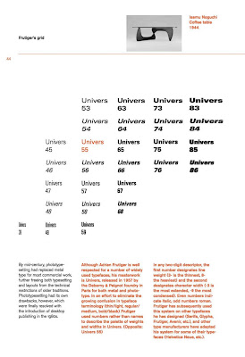
| Figure 5.1 Frutiger's grid |
In any two-digit descriptor, the first number designates line weight (3- is the thinnest, 8- the heaviest)and the second designates character width (-3 is the most extended, -9 the most condensed). Even numbers indicate italic, odd numbers roman.
Week 7
 |
| Figure 5.2 An expanded type 'family' |
In the last two decades, some typographers have developed families of typefaces that not only include a range of colour (light/regular/bold/black), but also incorporate serif and sans serif versions. Shown above in (Figure 5.1) are samples from Aicher's Roots family, drawn in 1989.
Week 8
 |
| Figure 5.3 Grey Value |
Best discussed elsewhere—hue, saturation, temperature—each colour has a specific value, a tone that describes the colours weight on the page as a percentage of black.
As we already know, full saturation of our colour has a grey value of 50%, it will always be lighter than a similar percentage of black. For example, 90% of this colour has a grey value of more or less 50% x 90%, or 45%. Note that straight math is only an approximate indicator. Trust your eyes.


Comments
Post a Comment