Advance Typography - Task 2
22.4.2024 - 28.7.2024 / Week 1- Week 14
Aliah Farhana Binti Mohd Fauzi / 0357957
Typography / Bachelor of Design (Honours) in Creative Media
Task 2 (A&B) - Key Artwork & Collateral
Aliah Farhana Binti Mohd Fauzi / 0357957
Typography / Bachelor of Design (Honours) in Creative Media
Task 2 (A&B) - Key Artwork & Collateral
INSTRUCTIONS
<iframe
src="https://drive.google.com/file/d/1tQ1_SHTShqaqFQoVNHQk2iJe8VKPj1gt/preview"
width="640" height="480" allow="autoplay"></iframe>
Task 2 (A & B) | Key Artwork & Collateral
In this task we were task to create our own brand identity based on our name
or pseudonym with minimum 4 letters and maximum 5 letters. Therefore, the
brand identity must have followed the three key words that individual has came
out with. Then we were task to design our own products could be t-shirt, cap,
jacket and etc. Lastly, we have to create an instagram to promote our design
and products.
MOODBOARD
SKETCHES
DIGITALISED SKETCHES
 |
| Figure 1.8 Final digitisation, Week 5 (23/05/24) |
I've make some modification on the letter of 'i' because I think there's too much distortion is happening on my artwork thus, in order to keep it nice and clean I've decided to make the letter of 'i' somewhat in a normal shaped.
COLLATERAL PROCESS
 |
| Figure 1.9 Print out 175 x 175 and 15 x 15, Week 6 (29/05/24) |
 |
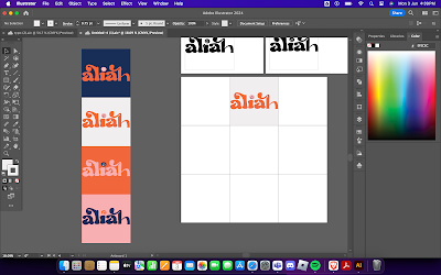
| Figure 1.10 My colour palette |
- 0C2D57
-FC6736
-FFB0B0
- EFECEC
 |
| Figure 1.11 Process for my IG grid, Week 6 (31/05/24) |
 |
| Figure 1.12 Finding a mockup for my brand identity, Week 6 (31/05/24) |
 |
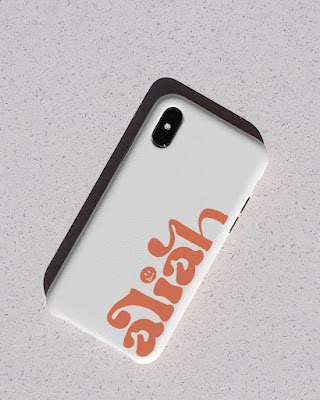
| Figure 1.13 Starting with phone case, Week 6 (31/05/24) |
 | |
|
 | |
|
 | ||
|
 | ||
|
AFTER FEEDBACKS
 |
| Figure 1.18 Finalised after feedbacks from Mr. Vinod, Week 7 (05/06/24) |
FINAL
Task 2(A) - Key Artwork
 |
| Figure 2.5 Wordmark in lightest shade of colour palette on darkest shade of colour of colour palette, Week 7 (08/06/24) |
Task 2(B) - Key Artwork & Collateral
Instagram Link
FEEDBACKS
Week 5
General Feedback - The more the white space you have the less impactful your works gonna be. Ensure the outcome is something more professional and meaningful.
Specific Feedback - Only 4 to 5 letters, Keywords needs to be extraordinarily avoid using negative keywords. Readability and legibility is important.
Week 6
General Feedback - Print out Key Artwork in 175 x 175 mm and 15 x 15 mm.
Specific Feedback - The keyword doesn’t really represent my logo. Please works on some of the logo strokes.
Week 7
General Feedback - Choose vibrant, engaging designs and maintain consistency in branding.
Specific Feedback - Use a single colour logo, use elements in my logo instead of using checkered, redo the patterns.
REFLECTIONS
Experience
This is not a whole new experience of me doing something like this, back in my foundation year I've tried to design a logo and a mockup on varsity jacket for my own course before. But still, this is my first experience creating my own branding using my own name. I have enjoyed doing this task 2 and this task 2 also has teach me a lot. As much as I like this task it doesn't meant that I'm not struggle with this project. There's bunch of designs that I've made but there's something off with the designs and I had to redo while thinking what kind of design was actually represent me for me to promote my branding. In the end, I've managed to pull it off and here my final look on the brand identity.
Observations
In order to create a logo or brand, the first thing that we designers should have are the keywords and readability is most important to have a solid branding. If we fails to do so, the branding will be less impactful.
Findings
I've to come out with bunch of sketches in order to come out with the best one. Therefore, to do this task to begin with one must have patience.
FURTHER READING
| This book was written by the author and few of his colleagues based on their's collections of their's classes notes. After a several years passed by they managed to educate thousands of students over thirty years. Therefore, this book was meant to inspire and show readers the evolution of typography. |
Week 5


%202.png)


Comments
Post a Comment