Interactive Design (Project 2)
22.4.2024 - 28.7.2024 / Week 1- Week 14
Interactive Design / Bachelor of Design (Honours) in Creative Media
Interactive Design / Bachelor of Design (Honours) in Creative Media
Aliah Farhana Binti Mohd Fauzi / 0357957
Interactive Design - Project 2
INSTRUCTION
<iframe
src="https://drive.google.com/file/d/1YzOGgXtiU2D6he1AMxXC_j40XMdej2Wg/preview"
width="640" height="480" allow="autoplay"></iframe>
Working Web Page
The objective of this assignment is to transform your static prototype from Project 1 into a fully functional and interactive web page. You will apply your knowledge of web layout class to create a working website that closely aligns with your original prototype.
Review your static prototype from Project 1 and analyze its layout, typography, color scheme, and imagery.
Use HTML and CSS to translate the design elements into code, ensuring a faithful representation of the original prototype.
Aim for pixel-perfect precision while maintaining responsive design principles to ensure compatibility across different devices and screen sizes.
Upload the file in Netlify, update your e-portfolio with all the processes documented in the blog, and submit the link as a submission
PROCESS
Link to my prototype Cvs click here
 |
| Figure 1.1 |
 |
| Figure 1.2 |
 |
| Figure 1.3 |
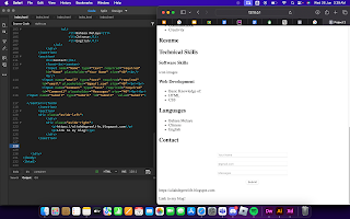
In Figure 1.1and 1.2 were my process on html, I've separated the information using <section></section> and in Figure 1.3 I've started to include css in my coding.
 |
| Figure 1.4 |
 |
| Figure 1.5 |
 |
| Figure 1.6 |
 |
| Figure 1.7 |
These Figure 1.4 - 1.7 are my code in html.
 |
| Figure 1.8 |
 |
| Figure 1.9 |
 |
| Figure 1.10 |
Click here to see my web page here
UPDATES
As I'm not satisfied with my work thus, I've decided to redo and make my
site better than previous one and this is my process of doing so.
From here, I've done a changes on the font weight an as well on my
picture.
Thus, in here you can see that the header is in sticky format and
where
I have also changed the layout for the contact me section to a better one.
Last but not least, I've added a footer in this improved version site of
mine and as well as I've formatted the layout well compared to the
previous one.
This is my new link here
REFLECTION
Experience
In this particular task, I've experienced that coding was really hard and I would say that I kinda of regretting on doing my CV's in this way because it make things even more harder to coding just because I am a beginner and never ever had any experience of coding before. Hence, this task has taught me how to coding a website and its actually pretty fun.
Observation
For the first link that I've submitted, I was unsatisfied with my work because doing this coding is really time consuming and I don't have enough time to actually make things properly. Therefore, as I submitted my first link my coding was beyond horrible and I am reflecting myself upon it and I've decided to resubmit it with a new link but with a slightly better version compared to the first one. As I learnt, I've observed maintaining consistency in design elements such as typography and colour schemes was essential to create a cohesive and professional-looking website.
Findings
I've found that, when doing coding one must not be under a lot of pressure and precisely have to use time carefully as doing coding actually will consume a lot of time.


Comments
Post a Comment