22.4.2024 - 28.7.2024 / Week 1- Week 14
Aliah Farhana Binti Mohd Fauzi /
0357957
Typography / Bachelor of Design (Honours) in Creative Media
Final
03 - Type Exploration & Application
INSTRUCTIONS
<iframe
src="https://drive.google.com/file/d/1tQ1_SHTShqaqFQoVNHQk2iJe8VKPj1gt/preview"
width="640" height="480" allow="autoplay"></iframe>
Task 3 | Type Exploration & Application
Explore the use of a typeface in the area of interest, understand
the existing relationship and identify areas that could be
improved and come up with possible solutions or combinations that may add value to the existing typeface. The work can be manifested in any kind of
format related to the issue being solved or explored. (gif/animation,
3D printing, different textures and materials etc.)
PROPOSAL
Purpose - Create a full set of typeface inspired by Rizze "Rizzing Day" album cover font.
Figure 1.1 Task 3 Proposal Slide, Week 9 (21/06/24)
SKETCHES

|
|
Figure 1.2 Upper case letters sketches, Week 10 (28/06/24)
|

|
|
Figure 1.3 Lower case letters sketches, Week 11 (01/07/24)
|
Before the digitised process proceed, I've sketched all the letters and
numbers manually in my notebook. This sketched was done just to get the idea
of how each of the letterforms are going to shape as.
DIGITISATION PROCESS

|
|
Figure 2.1 Digitised process 1, Week 9 (21/06/24)
|

|
|
Figure 2.2 Digitised process Uppercase, Week 9
(21/06/24)
|
|

|
|
Figure 2.3 Digitised process lowercase, numbers and
punctuations, Week 10 (28/07/24)
|

|
|
Figure 2.4 Digitised process, Week 12 (08/07/24)
|
|

|
|
Figure 2.5 Final digitised process, Week 13 (15/07/24)
|
|

|
|
Figure 2.6 Digitised process of the uppercase letter 'Z',
Week 13 (15/07/24)
|
|

|
|
Figure 2.7 Digitised process of the lowercase letter 'f',
Week 13 (15/07/24)
|
|

|
|
Figure 2.8 Digitised process of the uppercase letter 'G and
R', Week 13 (15/07/24)
|
|

|
|
Figure 2.9 Digitised process grid view, Week 13
(15/07/24)
|
|

|
|
Figure 2.10 Digitised process 'cmd Y', Week 13
(15/07/24)
|
|
FONT LAB PROCESS

|
|
Figure 3.1 Transferring each letters from AI to Fontlab,
Week 13 (15/07/24)
|
|

|
|
Figure 3.2 Finished transferring all the letters into a
fontlab, Week 13 (15/07/24)
|
|

|
|
Figure 3.3 Lowercase before kerning, Week 13 (15/07/24)
|
|

|
|
Figure 3.4 Lowercase after kerning, Week 13 (15/07/24)
|
|

|
|
Figure 3.5 Uppercase with kerning, Week 13 (15/07/24)
|
|

|
|
Figure 3.6 'G' and 'R' before redesign, Week 13
(15/07/24)
|
|
I have to redesign the letter 'G' and 'R' as the kerning process shows that
the two letters shapes makes a huge gap because of the sharpness on both of
the edges, thus I have trouble to make the kerning process for these two
letters.

|
|
Figure 3.7 'G' and 'R' after redesign, Week 13
(15/07/24)
|
|
After I've solved the problem between the letters of 'G' and 'R', the
same problem has occurred on the letters of 'N' and 'A'. Thus, the process of
redesigning both of the letters were needed.

|
|
Figure 3.8 Uppercase with kerning, Week 13 (15/07/24)
|
This is the result after redesigned the letters of 'A', 'G', 'R' and 'N' with
kerning.

|
Figure 3.9 Final uppercase with kerning, Week 13
(15/07/24)
|
|

|
Figure 3.10 Final lowercase with kerning, Week 13 (15/07/24)
|

|
Figure 3.11 Final uppercase and lowercase with kerning, Week 13
(15/07/24)
|
Link to download the font (here)
.jpg)
|
|
Figure 4.1 Final Font - JPEG, Week 13 (16/07/24)
|
FONT PRESENTATION

|
|
Figure 4.2 #1 Presentation - PNG, Week 13 (16/07/24)
|

|
|
Figure 4.3 #2 Presentation - PNG, Week 13 (16/07/24)
|
|

|
|
Figure 4.4 #3 Presentation - PNG, Week 13 (16/07/24)
|
|

|
|
Figure 4.5 #4 Presentation - PNG, Week 13 (16/07/24)
|
|

|
|
Figure 4.6 #5 Presentation - PNG, Week 13 (16/07/24)
|
|
FONT PRESENTATION

|
|
Figure 4.7 #1 Application - PNG, Week 13 (16/07/24)
|
|

|
|
Figure 4.8 #2 Application - PNG, Week 13 (16/07/24)
|
|

|
|
Figure 4.9 #3 Application - PNG, Week 13 (16/07/24)
|
|

|
|
Figure 4.10 #4 Application - PNG, Week 13 (16/07/24)
|
|
 |
| Figure 4.11 #5 Application - PNG, Week 13 (16/07/24) |
|
FEEDBACKS
Week 9
General Feedback: Sketching must have a guide grid to help the sketches to be
in order.
Specific Feedback: The ideas for proposal is not solid enough, if I
want to proceed with the proposal ideas, the outcome has to be
outstanding.
Week 10
General Feedback: Try to explore more and not to exhausted on one idea.
Consistency is stroke, width, and proportions needs to be consistent.
Specific Feedback: The proportion needs to be improve and use the
letter of 'C' as for reference.
REFLECTIONS
Experience
I've experienced yet again to design a font but this time around with
completed letterforms of uppercase, lowercase, numbers and punctuations. This
is not an easy tasks as it looks but I've enjoyed my time doing this task.
Looking back to my proposal on my First and Second ideas was getting a bad
feedbacks upon it, I've decided to find and explore more for a new idea.
Therefore, as I explore, I stumbled upon the RIIZE 'Rising Day' poster and has
catches my eyes as the title font was interesting and I've decided to proceed
with it as my third idea. Besides that, on the presentation stages I've done
3D for my font to make it look more interesting. While 3D was my first time
using it, I've watched several tutorials on how to do it.
Observation
I've observed that my font will be a bit dull if I didn't apply 3D effects on
my presentation and application stages. But under some circumstances to make
it as a title then it'll be fine as it is. Besides that, while I was doing my
kerning for my letterform I've found that making the letterforms too bending
will make the kerning process harder thus, there were some of the letters I
had redesigned which was a little bit hassle.
Findings
I've found that consistency is important in this task. All the letters have
to be in the same width, stroke and proportions to make it coherent.
Therefore, the usage of the grid while creating the letterforms is important
as well in the process.
FURTHER READING

|
|
Figure 5.0 A type primer by John Kane
|
The author, Grace Haley once pushed Hippocrates a bit to say that she
wrote short stories because 'Art is too long, life is too short.' That
sentiment nicely sums up what has kept this second edition off the
shelves until now.

|
|
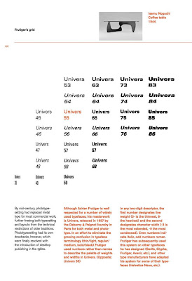
Figure 5.1 Frutiger's grid
|
Adrian Frutiger is well respected for a number of widely used typefaces,
his masterwork is Univers, released in 1957 by the Deberny & Peignot
foundry in Paris for both metal and prototype. In an effort to eliminate
the growing confusion in typeface terminology (thin/light, regular/medium,
bold/black) Frutiger used numbers rather than names to describe the
palette of weights and widths in Univers.
In any two-digit descriptor, the first number designates line weight (3-
is the thinnest, 8- the heaviest)and the second designates character
width (-3 is the most extended, -9 the most condensed). Even numbers
indicate italic, odd numbers roman.

|
|
Figure 5.2 An expanded type 'family'
|
In the last two decades, some typographers have developed families of
typefaces that not only include a range of colour
(light/regular/bold/black), but also incorporate serif and sans serif
versions. Shown above in (Figure 5.1) are samples from Aicher's Roots
family, drawn in 1989.

|
|
Figure 5.3 Grey Value
|
Best discussed elsewhere—hue, saturation, temperature—each colour has a
specific value, a tone that describes the colours weight on the page as
a percentage of black.
As we already know, full saturation of our colour has a grey value of
50%, it will always be lighter than a similar percentage of black. For
example, 90% of this colour has a grey value of more or less 50% x 90%,
or 45%. Note that straight math is only an approximate indicator. Trust
your eyes.


.jpg)


Comments
Post a Comment