Publishing Design - Task 1
Publsihing Design / Bachelor of Design (Honours) in Creative Media
Aliah Farhana Binti Mohd Fauzi / 0357957
- The book is one of the most important and influential as most important advances in publishing were centred around the book.
- The book is a medium to document and share ideas, knowledge, record, history and etc.
- Designing a book requires a comprehensive understanding of typography, good sense of a space, an eye for details, and a good understanding of a publishing software.
- Small Caps
- Numerals
- Fractions
- Ligatures
- Punctuations
- Mathematical signs
- Symbols
- Non aligning figures
- Small Caps & All Caps: Small caps are good for subheads or for the first line of a paragraph. Text set in All Caps should be used in short headlines or subheads. All Caps should never be used for long sentences and for emphasis.
- Special-Purpose Style: Many formatting styles exist within software's for making footnotes, references, and mathematical formulas. These tend to be embedded or nested within the tools sections and a lay user may not be aware of its functions.
- Text Scalling: Some program allow for the user to create a pseudo-condense or pseudo-extended font by horizontally or vertically squeezing or stretching a font. This distorts the original design of the font.
- Outline & Shadow: Another style that tends to be abused a lot is the outline or shadow styles. Thus happens when deluded individuals through a flick of a mouse, and the aid of a software, think they can do magical things. Its takes many years of practice and many more years of experience before one can format text beautifully and effectively. Please avoid outline and shadow as far as possible.
- The font used — some fonts require more line spacing than others to keep their ascenders and descenders from touching.
- The line length — longer lines require more leading for easier reading.
- The type size — the larger the type size, the more line spacing is needed.
- 270mm x 170mm
- 250mm x 200mm
- 240mm x 180mm

|
|
Figure 2.2 Book size exploration |

|
| Figure 2.3 The final cutout |

|
| Figure 2.4 Flat lay |

|
| Figure 2.5 Folded System with Labels |

|
| Figure 2.6 Screenshot of Indesign exercise |
Experience
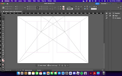
Throughout the first half of the semester, I engaged in a series of book design exercises, including text formatting, mock-up making, signature folding systems, classical grid structures, determining grids, and form and movement exercises. The text formatting exercise introduced me to the complexities of managing typographic hierarchy and maintaining consistency. Mock-up making required precision, especially when cutting and folding materials to create physical prototypes. Working on signature folding systems (8+8=16) involved learning how to construct and sequence booklets accurately, while classical grid structure exercises emphasized the importance of precise layout setup. When determining grids, I experimented with different structures to suit varied content, and the form and movement exercises challenged me to balance colors, images, and text cohesively.
Observations
I noticed that even minor variations in text formatting could greatly affect readability and the overall design's visual appeal. During mock-up making, I observed that high-quality materials and accurate measurements were crucial to achieving a clean and professional look. Signature folding systems highlighted how misalignments could disrupt the reading flow, and classical grid structures provided balance and harmony, ensuring each design element fit seamlessly into the layout. In determining grids, I observed that flexibility was key, as some designs required adjustments to accommodate different content types. The form and movement exercises revealed the impact of color, image, and text combinations on visual movement, emphasizing how each element must work together to create a cohesive and engaging composition.
Findings
From these exercises, I learned the importance of maintaining a clear typographic hierarchy and consistent alignment to enhance readability and design quality. Mock-up making taught me the value of precision and material selection, while the signature folding system exercise emphasized attention to detail in achieving a smooth, functional booklet. Classical grid structures underscored the necessity of balance in layout design, and determining grids highlighted the importance of adaptability to organize content effectively. Finally, the form and movement exercises demonstrated that a well-balanced use of form, color, and imagery is essential for guiding the viewer's eye and creating a visually impactful design. Thank you to Mr. Hijjaz for the valuable feedback that helped me refine my approach and understanding throughout these exercises.


Comments
Post a Comment