21.4.25 - 27.7.25 / Week 1 - Week 14
Packaging and Merchandising Design / Bachelor of Design (Honours) in Creative
Media
Aliah Farhana Binti Mohd Fauzi / 0357957
Exercises
INSTRUCTION
Module Information Booklet
Exercise | Packaging Design Analysis
Duration: 4 weeks (1 product a week)
Overview
We're to choose FOUR (4) products in the market that we believe have poor packaging design. Ensure the product is readily available for purchase.
Product Analysis
We have to conduct a thorough analysis of the existing packaging design. Identify the specific shortcomings and challenges in the current packaging. Consider factors such as functionality, aesthetics, sustainability, target audience, and branding.
Market Research
Investigate the target market for each product and assess how the current packaging aligns with the expectations and preferences of the target audience.
Competitor Analysis
Research and analyze the packaging designs of competing products in the same category. Identify trends and best practices in packaging design within this product category.
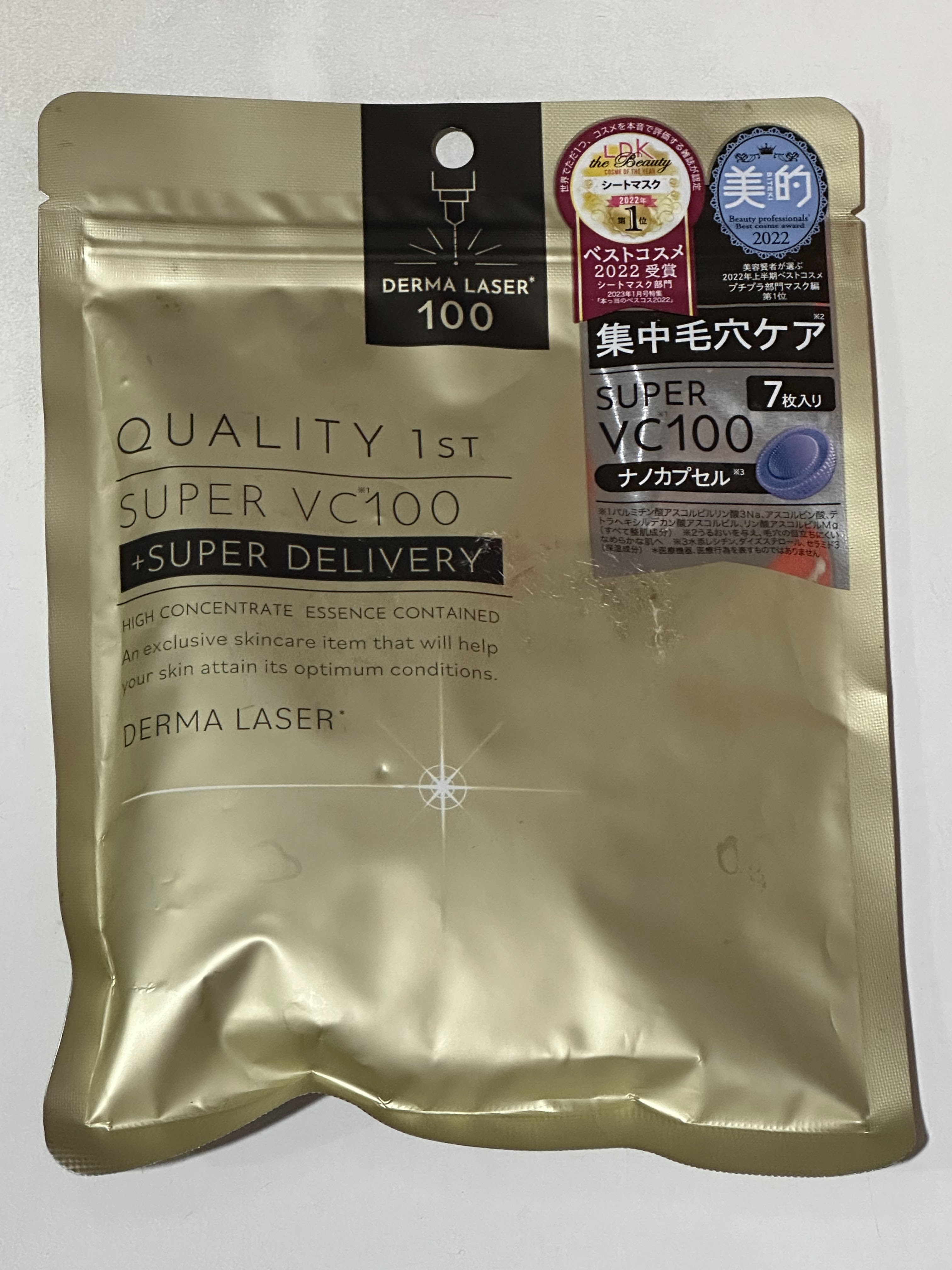
Product 1
 |
| Figure 1.1 Product 1 (Makeup Remover) |
Overview
One of the products with poor packaging design is this makeup remover wipes pack, which is readily available in many retail stores such as Watsons. Although it serves a basic skincare function, its packaging design presents several practical and aesthetic issues that affect usability and product quality.
Product Analysis
The most critical flaw in the current packaging is the adhesive seal closure. Over time, the adhesive loses its effectiveness, causing the pack to stay open. This leads to the wipes drying out, which compromises their functionality. From a design standpoint, the visual elements are outdated and lack distinctive branding. The packaging does not communicate a clear identity, making it hard to stand out among competitors. Additionally, the use of non-recyclable materials suggests a lack of consideration for sustainability, which is increasingly important to consumers.
Market Research
The target market for this product likely includes young adults and skincare users looking for convenient cleansing solutions. However, the packaging does not align with user expectations for hygiene, durability, and freshness. These consumers are also drawn to more thoughtful, visually appealing designs, especially in a market where shelf competition is high.
Competitor Analysis
Compared to clinical skincare brands that often use sturdier, snap-shut lids (such as those found in Clinique’s makeup remover wipes), this product falls short in functionality. A hard lid helps maintain product freshness and reflects higher quality. In terms of shelf appeal, brands like Biore and Simple offer designs that are more modern, clean, and visually attractive. These brands often use clear typography, color coordination, and strong brand consistency—design strategies that help them stand out and connect better with their target market.
 |
| Figure 1.2 The Competitors (Bifesta and Simple Wipes) |
Product 2
 |
| Figure 1.3 Product 2 (Candle box) |
Overview
This poor packaging design is a scented candle purchased from Cotton On. While the product itself may serve its function well, the packaging lacks critical elements expected from a candle product, which negatively impacts customer experience and shelf appeal.
Product Analysis
The packaging does not visually communicate that it contains a candle. There are no graphics, icons, or structural cues typically associated with candle products, making it easy to overlook. Furthermore, there is no mention or description of the scent notes on the exterior. This forces potential buyers to open the box just to determine what the candle smells like, a frustrating and impractical experience in a retail environment. The lack of scent-related information also undermines emotional connection, which is vital in fragrance-based products. Aesthetically, the box appears plain and generic, missing the opportunity to create a sensory or lifestyle connection with the buyer. Branding is minimal, and the design doesn't align with the cozy, aromatic essence usually associated with candles.
Market Research
The target market for scented candles includes lifestyle shoppers and gift buyers often individuals looking for ambiance, self-care, or decorative home items. These buyers expect the packaging to reflect the product’s fragrance, mood, and quality. Emotional storytelling and descriptive notes play a major role in driving purchases in this category. Cotton On’s plain packaging lacks these elements, missing the expectations of a design-savvy, scent-sensitive audience.
Competitor Analysis
While the Cotton On candle box does state the scent name "Citrus Sunflower," it still lacks the descriptive elements and visual cues that help communicate the fragrance experience to the consumer. In comparison, brands like Bath & Body Works not only name the scent but also include detailed fragrance notes (for example, “sparkling citrus, fresh petals, soft musk”) and pair them with themed visuals or colour palettes that reflect the mood of the scent. This enhances both shelf appeal and emotional connection. Similarly, Diptyque uses elegant, minimalistic packaging but clearly labels the scent in a refined way and often supports it with fragrance storytelling through product literature or box design. These brands succeed by offering clear and immersive scent communication, which Cotton On's packaging lacks. Simply stating the name "Citrus Sunflower" without a description or accompanying design results in a flat presentation that doesn’t fully engage the customer or express the character of the scent.
 |
| Figure 1.4 The Candle Competitors (BBW and Diptique) |
Product 3
 |
| Figure 1.5 Product 3 (Sheet Masks) |
Overview
This sheet masks poor packaging design is a Japanese skincare item: a multi-pack facial sheet mask set containing ten individual sheet masks in a single sealed plastic pouch. This product was purchased from a drugstore and is readily available to consumers. While the format aims to promote sustainability by minimising the use of individual sachets, it introduces several practical issues that negatively impact the overall user experience.
Product Analysis
The most critical flaw in this packaging is the poor sealing quality. Users often experience leakage of the skincare essence, particularly after the package is opened, which not only leads to product waste but also compromises hygiene. The design makes it inconvenient to extract a single sheet mask without contaminating the others, and the absence of an effective resealing mechanism means that the remaining masks may dry out quickly. Aesthetically, the packaging is minimal and clean, in line with typical Japanese skincare branding, but it lacks visual cues that convey its sustainable intent or help it stand out among competitors. Although the packaging seeks to reduce environmental impact, its practical flaws undermine the product's usability and longevity, ironically making it less sustainable in the long run if consumers are forced to discard it early.
Market Research
The target market for this Japanese drugstore skincare product is eco-conscious and skincare-savvy individuals, primarily women aged 20 to 40 who are invested in daily beauty routines and familiar with multi-step regimens. These consumers are drawn to products that combine quality ingredients with practical, hygienic packaging. While sustainability is an important value to this demographic, it must be paired with functionality. Unfortunately, the current packaging does not align with their expectations, as the leakage issues and lack of resealability clash with the need for cleanliness and ease of use.
Competitor Analysis
When assessing this Japanese drugstore sheet mask product, it becomes clear that several competitors offer far more effective packaging solutions, both in terms of hygiene and usability. VT Cosmetics, for example, packages its sheet masks in a hard, resealable box that allows users to pull out one mask at a time without exposing the rest to air. The box seals tightly to retain moisture and prevent leakage, solving the hygiene and drying issues found in soft pouch packaging. Similarly, Saborino, a well-known Japanese brand, uses a soft pack format with a built-in plastic lid, much like a wet wipes container. This makes it easy to access one mask while keeping the others fresh and protected, ideally for daily use and on-the-go lifestyles.
In contrast, many other leading skincare brands prioritize hygiene by packaging one sheet mask per sachet. Brands such as Mediheal, Dr. Jart+, Innisfree, TONYMOLY, and The Face Shop use individual foil or plastic pouches that are tightly sealed, preserving the freshness and full amount of serum until use. These brands also often feature visually appealing designs with strong branding elements that stand out on shelves and convey product benefits at a glance. This approach is ideal for casual or first-time buyers who may want to try a single mask without committing to a full pack. However, for regular or bulk buyers, this type of packaging becomes less environmentally friendly due to the increased amount of waste generated per use. In these cases, brands could consider offering alternative packaging formats, such as the resealable box used by VT Cosmetics or the convenient lid-sealed soft pack from Saborino, which allow multiple masks to be stored hygienically with less material waste. This hybrid approach would better cater to both sustainability concerns and user convenience depending on purchase behaviour.
Compared to these best practices, the current Japanese sheet mask product in a soft-sealed pouch falls short. While it aims to be sustainable, the poor sealing, leakage issues, and lack of resealability make it impractical and wasteful in real-world use. Competitors show that it is possible to balance sustainability with functionality through smarter structural design and thoughtful material choices.
 |
| Figure 1.6 The Competitors Product |
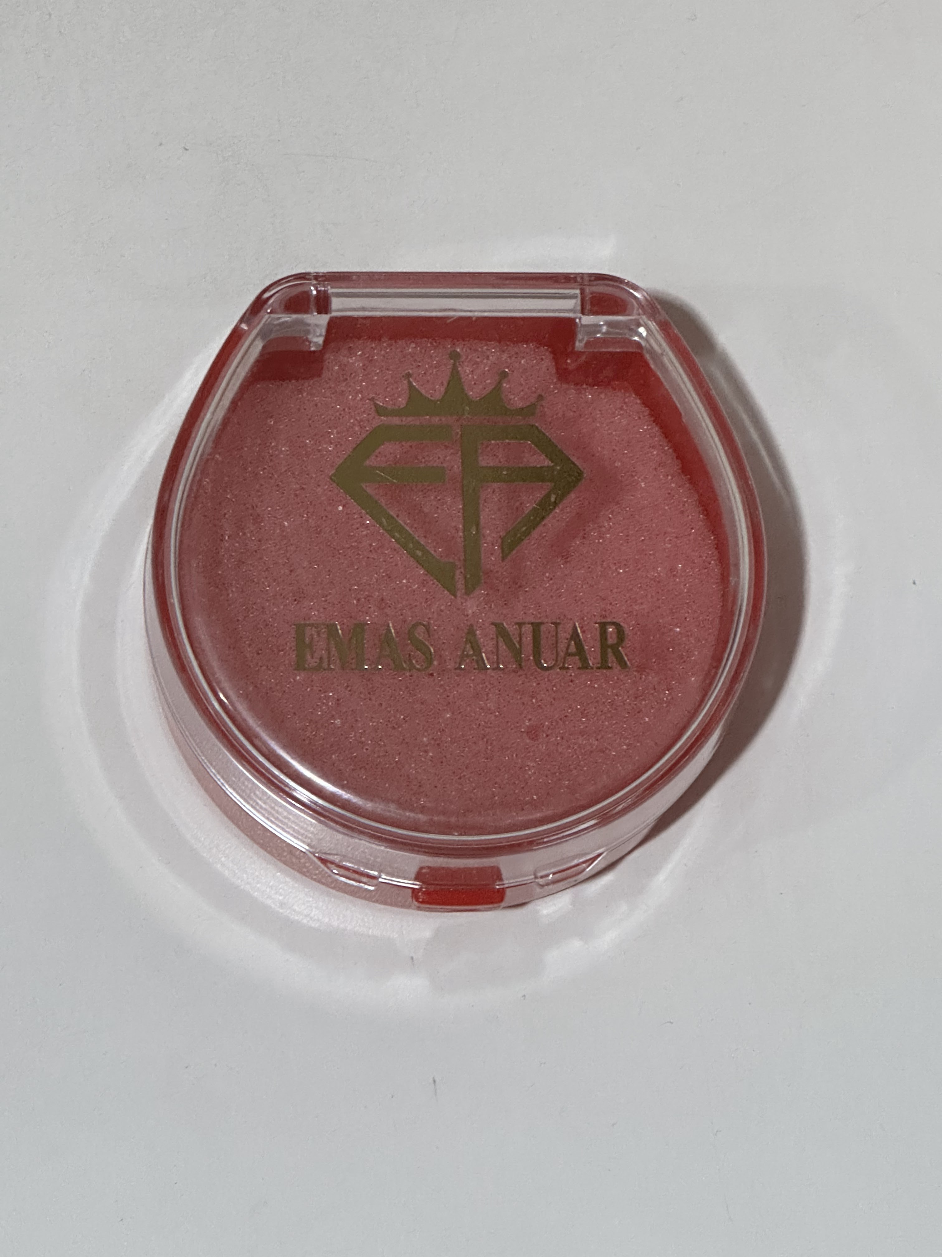
Product 4
 |
| Figure 1.7 Product 4 (Jewellery Box) |
Overview
One product in the market that demonstrates poor packaging design is a gold bracelet from the brand
Emas Anuar. Despite being a high-value item made of pure gold, the bracelet was packaged in a plastic container that closely resembles a low-cost cosmetic item, such as a blush compact. This discrepancy between the value of the product and the perceived value of its packaging significantly undermines the overall customer experience. Packaging plays a crucial role in conveying luxury, especially for jewelry, and this choice of container fails to meet the expected standard for such a premium item.
Product Analysis
The current packaging design, while functional in terms of basic protection, falls short in many key areas. It does not provide the kind of secure or elegant enclosure expected for fine jewelry. Aesthetically, the packaging strongly resembles a makeup product, which may confuse or even disappoint customers expecting a luxurious presentation. The clear plastic material and shape lack sophistication and do not enhance the product's appeal. From a sustainability standpoint, the plastic is likely non-recyclable and gives no indication of being eco-friendly. Branding is also an issue; the logo and overall design do not reflect a premium image. The packaging fails to communicate the exclusivity, heritage, or elegance that typically accompany gold jewelry, weakening the brand's perceived value.
Market Research
The target market for gold jewelry typically includes adults aged 20 to 50, who purchase these items for investment, status, or as meaningful gifts. This audience generally expects a sophisticated unboxing experience that matches the value of the product inside. Standard expectations include sturdy boxes made of velvet, leather, or high-quality cardboard, often with soft interiors and gold or embossed branding. Unfortunately, the current packaging for the Emas Anuar bracelet does not meet these expectations. Instead of enhancing the product’s appeal, the packaging may lead customers to question the authenticity or quality of the jewelry itself. This mismatch can harm brand trust and reduce customer satisfaction, especially in competitive markets.
Competitor Analysis
When compared with competitors in the same category, Emas Anuar’s packaging design is significantly lacking. Brands like Habib Jewels and Poh Kong use elegant velvet or leather boxes, often with gold foil stamping, hinges, and soft padding to cradle the jewelry securely. SK Jewellery, for instance, offers matte black boxes with magnetic closures that emphasize elegance and exclusivity. These packaging choices not only protect the jewelry but also elevate the unboxing experience and align with luxury brand expectations. Such designs reinforce the value of the product and leave a lasting impression on customers. Emas Anuar’s current approach, however, does not reflect these best practices, making it difficult to compete in the premium jewelry market.
 |
| Figure 1.8 The competitors packaging |
Product 5
 |
| Figure 1.9 Product 5 (Acne gel) |
Overview
TIDACT Gel is a well-known and effective topical medication for the treatment of acne vulgaris. Despite its proven efficacy, the product suffers from a major flaw in its packaging design. It comes in a traditional metal tube with a screw cap, which is prone to breakage, especially near the folded end or around the neck of the tube. This not only causes the gel to leak but also leads to product waste, hygiene issues, and inconvenience for the user.
Product Analysis
From a functionality perspective, the current tube packaging does not meet the demands of regular use. The metal tube is fragile and easily cracks under pressure, particularly as the product nears its end. Once the tube breaks, it often leaks uncontrollably, making the medication difficult to store or carry, and can even stain fabrics or contaminate surfaces. Aesthetically, the design is basic and clinical which is appropriate for pharmaceutical products but it lacks appeal and is not user-friendly. The typography and color scheme are clear but not distinctive or modern. Sustainability-wise, metal tubes are recyclable, but the plastic cap and potential product residue make it less eco-friendly if not disposed of properly. Branding is minimal, focusing on function over form, but there is room for improvement in usability and perceived quality.
Market Research
The target market for TIDACT includes teenagers and young adults, typically between the ages of 13 and 30, who are struggling with acne and seek reliable dermatological solutions. These users value hygiene, ease of application, and convenience, especially since acne treatments are often part of a daily skincare routine. However, the current packaging design fails to meet those needs. Users expect mess-free dispensing, portability, and durability. The fragile nature of the tube and its tendency to leak do not align with these expectations, leading to frustration despite the product's effectiveness.
Competitor Analysis
Competing acne treatment products such as Benzac AC, Differin Gel, and The Ordinary acne serums typically come in soft plastic tubes or pump bottles. These formats are much more durable, hygienic, and easier to dispense in controlled amounts. Brands like CeraVe and La Roche-Posay also package their treatment products in airless pumps or squeezable plastic tubes that prevent contamination and maintain the product’s integrity. These packaging designs represent best practices in this category, emphasizing user convenience, cleanliness, and minimal waste. Compared to these, TIDACT®’s outdated and fragile metal tube places it at a disadvantage, potentially discouraging repurchases despite the product’s strong efficacy.
 |
| Figure 1.10 The competitors packaging product |


Comments
Post a Comment